Sketching People

I decided recently to start a YouTube channel, I thought tutorials are fun to do and we all contribute with our own ways to do things. I wanted this to be a fresh approach, a casual way to look at how-to’s.

I this series in YouTube (https://m.youtube.com/watch?sns=em&v=k2esXE-_VyU ) you’ll notice I refer to “Haikus” They are a Japanese poem form that totals 17 syllables in a count of 5-7-5. You will see that they may be in my videos in sets of three lines at once, or sometimes scattered through the video when the sketch is done in a shorter time.

About the process:
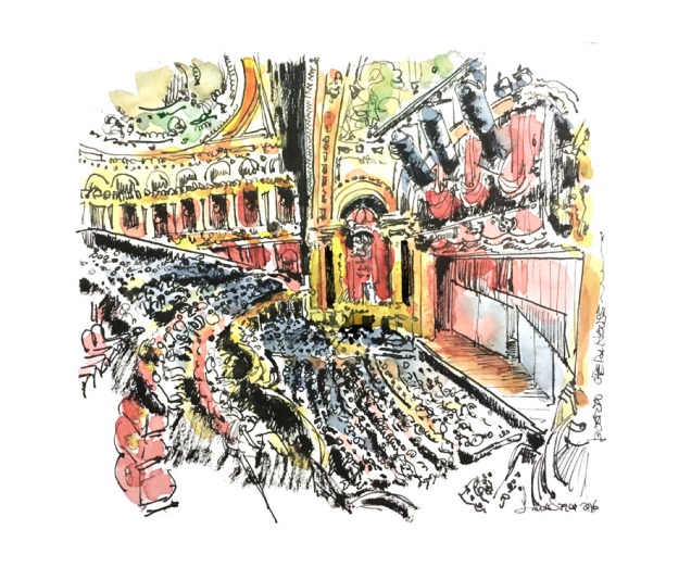
I rarely use pencil unless it’s a large complex drawing. Here you can see the process in a time-lapse but I will explain more below:

Step by Step:

I usually start by setting the horizon line
People Plates_1.1.1
I continue by working on the figures in focal point and near surrounding space. I used Higgins permanent ink and a fine nib and holder
People Plates_1.1.2
I try to vary the pressure here and there to have different widths of line to create a visual rhythm
People Plates_1.1.3
I then add the environmental elements, trees and foliage.
People Plates_1.1.4
I test the saturation of the watercolor prior to applying as the first wash must be very light. Fitst wash it’s the “base color”. I let this first layer dry completely.
People Plates_1.1.5
…continuing with a light wash on the rest of the elements
People Plates_1.1.6
Time for a second pass with more saturation, and only on small areas I want to draw the attention in the focal point.
People Plates_1.1.8
I like to play with different greens, not necessarily accuracy with the right green but more the right value . Also this tells the viewer it’s a separate element not part of the same group (background, mid-ground or foreground)
People Plates_1.1.7
…going for a third pass on contrast. this is the strongest saturation almost no diluted at all.
People Plates_1.1.10
…and the final sketch.
ppl

The Boston Opera House

This weekend I went to the Boston Opera House and It’s such a beautiful interior ! I couldn;t resist to make a watercolor of it. The colors are so rich.

I did this is a Stillman and Birn sketchbook as usual. I recently got more art supplies and wanted to try my new brushes this is the Escoda Versatil #12. To be synthetic it’s a pretty good brush!

For the darks I used the pentel brush and I drew this not with my usual Lamy but a nib and holder.

I haven’t sketch in a while. I feel rusty but I think this came out acceptable 🙂

opera900

Daniel Radcliffe

I made this portrait of Daniel Radcliffe from a black and white copy. I made up the colors using my usual palette for skin tones and Walnut ink for the hair.

My procedure for portraits is based on simplification. Drawing is not what you draw but what you leave out. I begin with a very accurate ink drawing. If the features are somehow hard to get I start with pencil first, but Radcliffe has a very distinct face that is somehow easy to do. The likeness is pretty much attained by an exaggeration of the eyebrows and getting the eyes right. The jawline is also key in this case.

As in anything, things come out better when you are in familiar territory, your usual palette, your best paper, and your favorite brushes. I particularly feel at home and use no other paper for all my work than the Stillman and Birn brand, because it absorbs washes beautifully without warping. The heavy stock is just perfect for watercolor. This Portrait was done on the Beta Series on a 9×12 notebook, Natural white, Rough Surface, Extra Heavy Weight, 180lb. When I use only Ink I usually go for the smooth surface of the Heavy Stock Zeta Series. The Beta has the extra tooth that holds the water runs better.

All my sketches are done with my favorite fine point fountain pen.

When I do portraits I try to create a rhythm of contrasts so your eye jumps from dark spot to dark spot back and forth keeping the interest in the portrait in a circular motion. The warms and cools also play a part in that rhythm. Since in this portrait most of the real state is warm, the cooling factor is the blue eyes. Eyes are the feature that we feel mostly attracted to in a face, so a very bold blue in that focal point compensates for all the warmth that is around. This cool color finds then a visual connection with another cooling color, the greenish blue of the shirt, between those two I feel I accomplished a balance and the portrait feels right. The shading in the face is done using about three layers of watercolor, allowing the first layer to dry completely.

Depending on the light source direction I start my first wash with The main skin tone. then I add the first pass of dark brown and follow with the lighter and darker skin tones once the first layer is dry. The cooling touches are at the end. The coloring process is about 15 min, The drawing part takes about 25-30 min

10
I included my palette here with my regular colors that are both for landscapes and portraits. I have a special spot for skin colors as you can see, my darks and lights and my neutrals

IMG_3523
Here the list:

Alizarin Crimson,Cad Red Light, Orange Yellow, Raw Umber, Burnt Sienna, Yellow Ocher, Cad Yellow Pale Hue, Pelylene green, Sap Green, French Ultramarine, Prussian Blue, Cerulean Blue, Violet, Lamp Black (Lamp black is opaque and highly staining, it makes the darks really dark as opposed to the Ivory black that is a warm semitransparent black that blends better with other pigments, I personally prefer more opacity)

Gouaches: White, Beige, Pale Peach, Flesh and Jaune Brilliant (Main skin color)

On regard to brushes I always use natural hair as it holds more pigment.

Here below are some short clips that show the normal speed in which I usually work as in watercolor you pretty much work with the flow and must be a rather quick application and in every layer pass, more and more specific in small spots/areas to create contrast.


Wedding at Martha’s Vineyard, MA

On Sep 26, Saturday was the wedding we were hired to sketch at Martha’s Vineyard. It was quite an experience to have so many moving subjects and trying to chase-a-sketch! We managed to get a few done and some were colored afterwards. We got about a dozen done each of us in 4hrs.

I chose Stillman and Birn Zeta series notebooks for this, The hard stock takes the watercolor beautiful without warping. I used Koi watercolors, they are a little volatile but it is good to have scans so I can reprint them in their original color saturation.

The bride, young actress Julianna Gill (from Friday the 13) here with her little nephew and Dave Franco with fiance Allison Brie (from Madmen) are here in these sketches.

We didn’t realized who they were until a while later which helped in the sense of not being star struck while drawing!
It was quite stressful to try to sketch in so little time as many sketches as possible but I did learned a lot. On the next gig, if we have another one like this, I think I will apply watercolor off site if i have to work this fast because running with a wet tray and brushes, while holding a sketchbook a pen and a water container just… Doesn’t work!
Some sketches were very… “Accidental” *_* like the color one here, that sky is a bad spill… my tray fell over the sketch.
My friend Mia said that this was a gig that could break the most confident speedy sketcher! And yes when I saw my works I wanted to cry :I but I worked on them at home a little more, adding watercolor touches here and there. Some of them I didn’t have time to add color.

Untitled-1

0 1 2 3 copy 4 5 6 7 8 9 11 12 14 15

Latest portrait Sketches

11110985_951215894930125_4283114786214278327_n

16482_951160118269036_2034851959731503904_n

11012065_951165904935124_3476144564064591375_nIt’s been a while since I did some watercolor portraits, so I decided to add some new to my portfolio. As usual I use Stillman and Birn notebooks in this case the the Zeta Series.

I usually work pretty fast on these, as spontaineity is key to maintain a loose efect on line and strokes.

I probably spend more time on selecting my limited palette and color composition than I do creating the strokes.

A good base drawing doesn’t need much as it sustains itself, but color excess can ruin even the best sketch

I was more happy with Dan’s portrait from all three

Urban Sketchers Boston Meetups

#Instagram #UrbanSketchers #UrbanSketchersBoston
The Pilot fountain pen calligraphy Purera with a converter for noodler’s bulletproof ink. Very happy about it ! It doesn’t clog and a very smooth line! Here with the last two meetups sketching the Boston Garden and Fanueil Hall. Views from above are challenging as the perspective of the human scales don’t have the horizon line reference,so pretty much going by eye and by buildings proportion to scale them.
Follow

Urban Sketchers Boston

Family Portrait sketch

for Myartsketch.com

This sketch was done on Bristol Plate, with Lamy EF pen and Cotman’s Watercolors. 20 min. Here is the black and white and the color version. I used little lines because I wanted the color brush strokes to be more visible. Its a very light watercolor study.

IMG_5338 copy

10626612_819482234770159_5544420895153251386_n

These above are random sketches from last month the first one with a nib and handle on a bristol plate mini sketchbook and the second with the Lamy Pen on Stillman and Birn notebook