Pen and Ink Portraits November

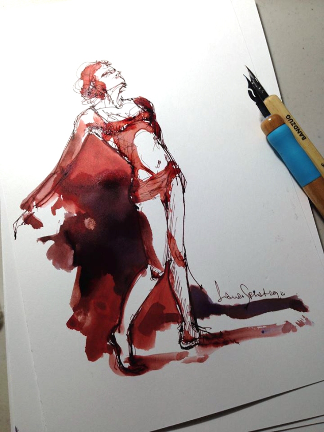
Portraits it’s my favourite subject. I have found a lot of inspiration in images from the SKCHY app community.

These portraits take from 20 to 40 min and are all done with a Lamy Pen, a pen and nib holder for the heavier lines, and the Pentel Brush on Stillman and Birn paper, Beta series.

I’m trying to be more defined by investing more time in detail. From the begining I set my mind in how much time I want to spend on the sketch. Then I draw my lines accordingly slowing down or taking time with the strokes. There is a significant difference between short or longer sketches. I always aim for the sketch to “feel” complete so when i work I work all over, like i don’t start with an eye making it all detailed, I start with an oval shape, placing marks and looking for distinct features that makes that particular face unique, I then exaggerate a little those features and find a touch of beauty that comes naturally. There is a difference in how I see and feel a face from what I try to translate it to lines. Like having an insight on what the face expresses to me. I try to reveal those thoughts visually.


Sketching People

I decided recently to start a YouTube channel, I thought tutorials are fun to do and we all contribute with our own ways to do things. I wanted this to be a fresh approach, a casual way to look at how-to’s.

I this series in YouTube (https://m.youtube.com/watch?sns=em&v=k2esXE-_VyU ) you’ll notice I refer to “Haikus” They are a Japanese poem form that totals 17 syllables in a count of 5-7-5. You will see that they may be in my videos in sets of three lines at once, or sometimes scattered through the video when the sketch is done in a shorter time.

About the process:
I rarely use pencil unless it’s a large complex drawing. Here you can see the process in a time-lapse but I will explain more below:

Step by Step:

I usually start by setting the horizon line
People Plates_1.1.1
I continue by working on the figures in focal point and near surrounding space. I used Higgins permanent ink and a fine nib and holder
People Plates_1.1.2
I try to vary the pressure here and there to have different widths of line to create a visual rhythm
People Plates_1.1.3
I then add the environmental elements, trees and foliage.
People Plates_1.1.4
I test the saturation of the watercolor prior to applying as the first wash must be very light. Fitst wash it’s the “base color”. I let this first layer dry completely.
People Plates_1.1.5
…continuing with a light wash on the rest of the elements
People Plates_1.1.6
Time for a second pass with more saturation, and only on small areas I want to draw the attention in the focal point.
People Plates_1.1.8
I like to play with different greens, not necessarily accuracy with the right green but more the right value . Also this tells the viewer it’s a separate element not part of the same group (background, mid-ground or foreground)
People Plates_1.1.7
…going for a third pass on contrast. this is the strongest saturation almost no diluted at all.
People Plates_1.1.10
…and the final sketch.
ppl

Some Tutorial Sheets

These handsheets were made for a past workshop for the local sketchers. They illustrate several concepts and tips for sketching

-How to draw gesture


-How to approach simplification of scenes


-The concept of Transitional Space when sketching interiors


These sheets will be available as PDFs at our urbansketchersboston Facebook group

http://www.urbansketchersboston.com

Join us if you live in New England!

Starbucks at Harvard Square

Urban Sketchers Boston had a meetup at Harvard Square, and the interior is so cozy and nice with a warm atmosphere. For this I used the Carbon Platinum fountain pen, the finest point I have ever seen on a fountain pen! and my favorite brand of notebooks Stillman and Birn, Zeta series, great for ink

IMG_6535-900

Cirque de Soleil

Last weekend I went to the show Kurios and it was a delightful experience! I’m a fan of steampunk and the show was very inspirational.

The action is very quick for me to capture in the detail I would like so i based my sketches in still images.

I used my favorite paper Stillman and Birn notebooks. The Zeta series are great for ink and the heavy stock can take some washes too.

The first is the comedian of the show, he was one of my favorites and the second is one of the amazing contortionists.

I really wanted to make a bit of more elaborated sketch with detail. I used the super fine platinum carbon fountain pen. The most fine line there is! I can get different thickness with it.

I used private reserve inks as well. And inexpensive bamboo brushes. I don’t like to use the same brush for both ink and watercolor i prefer to assign a use on either of the two mediums. For watercolors i use my best.

img_6456-1

img_6322-1img_6323-1img_6458-1

Testing some inks

On a cold day with 3 F outside and listening to Leonard Cohen a lady dances in my head to the end of love.

—-
inks: purple wampin, Rome Burning, black Red and Vampire red (private reserve) and the Zebra nib on Stillman and Birn Beta series paper cut from the notebook.

The problem I have working wet media on a notebook is the stains it makes on the back of the previous page, so I tore them off and trimmed with the guillotine. This ink dries fast, though!!

12705599_1085233488195031_4770658893331687122_n 12742702_1085233484861698_3349510706945393067_n 12744075_1085233481528365_5987789316419189040_n