Taking the challenge posted my Mark Holmes in his blog -and Liz Steel-, they do this every year. Here some of my sketches. I decided to focus on figure this time


Taking the challenge posted my Mark Holmes in his blog -and Liz Steel-, they do this every year. Here some of my sketches. I decided to focus on figure this time
Handouts for my latest workshop class on the Reilly Method of drawing portraits.
This is the most intuitive way to draw portraits I have ever found. Based on relationships. When I learned it I used to get lost into the process of where to start, how to see. I created this sequence to un-complicate the thought process for anybody who learns it for the first time. So see it applied here’s a post and here another post
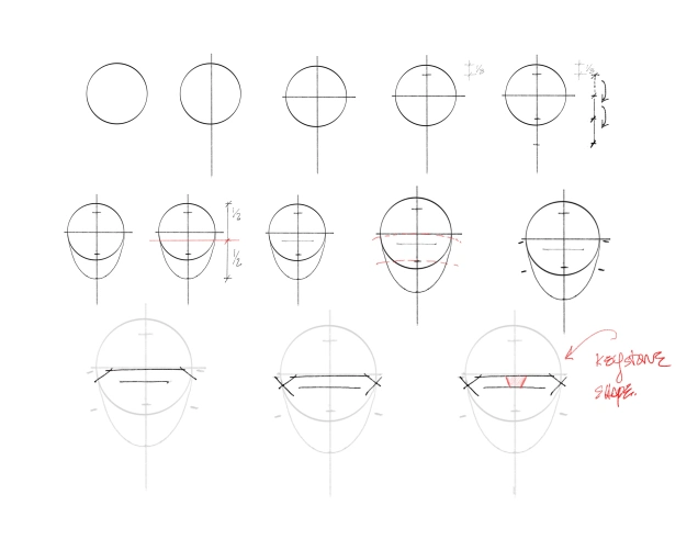
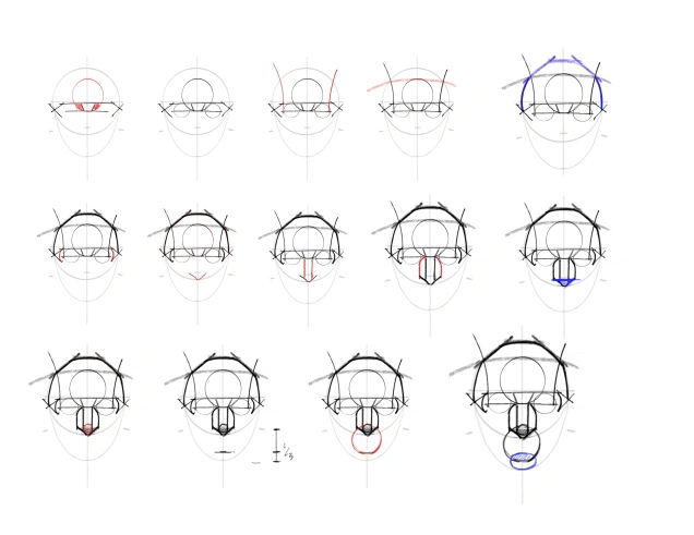


This method really helps to get the likeness of the subjects. It’s based on relationships. I think there are methods that seem to feel more natural than others. I have tried Bridgman’s too and Loomis. There are some overlaps, it is helpful to learn about them all as they form a good foundation for the understanding of the head structure (full body anatomy as well)
I did several tries, I wanted to get the likeness but also to enhance what the model projects, she is classy and elegant naturally, a piercing glance with confidence yet very sweet.
The hair mass was fun to do. natural curls and jet black. black hair can be challenging to show texture and the direction of the strands, I used the finest point I had to give a loose texture all around the edge to suggest curly hair, and the natural shine of black hair. In reality the highlights are blue but with a black and white translation it’s just a matter of value. I was frugal with expression lines, with women and children, too many lines can age the face very quickly even if one is true to original. The rule of less is more.
 I put special attention to the lips, it’s easy to fall into doing an outline, when the subject has lipstick and lip liner but again, it needs to be treated as value and breaking the mini volumes that form the cluster of the lip shapes, each of these mini volumes shaded in isolation for the final sum of the whole effect. Same with the 6 parts of the nose, the bony part the cartilage split in half, the wings and the tip of the nose. In some faces the split it’s almost invisible making out a very exquisite ball of the nose. It is necessary to be aware of this even if those lines are not drawn, if you understand what is to be found you can understand it’s visible absence too, or if a little hint is needed.
This method allows placing of the features in the right place, by drawing the spaces and delimitating the areas where the planes meet. It makes shading easier too as you see which planes, as the mapping shows, are in shadow, light, and where midtowns are as well. At the final pass in the inking process is really a process of elimination of the pencil work, with as few lines as possible, keeping ONLY those lines and shadows that tell the story of this face, it’s identity.

Following the challenge that Marc Holmes posted in his blog:
I decided to take part this year. I love sketching people. from gesture to expressions, from loose to detailed. I thought this could be a good opportunity to warm up as I haven’t been sketching much lately. Today is Day 4. i will be adding one last day tomorrow. I hope I can make it! I used the Pentelbrush for most of these.
Update Friday March 9 3:04 pm challenge completed!


Pole dancers are very fun to sketch, the way they twist their bodies and do unusual poses and moves is very interesting and fascinating, like ballet, performance art. I did these from instagram friends. They are all done in ink with the carbon pen and the Lamy safari on a Stillman and Birn notebook.
For accuracy, I penciled first to resolve proportions, so that my line is cleaner when I ink rather than an spontaneous sketch that has many squiggly lines that fall around a ballpark approximation of proportion. I wanted to give justice to the beauty of these girls and their fabulous art.


 I have been studying anatomy and expression, and revisiting the Reilly method of drawing. I learned the Reilly method through years of working at a studio of a very accomplished portrait artist in Boston: Mr Ouelette. Barbara Morse, another brilliant artist and wonderful woman, gave classes in his studio for years, and I was a fly on the wall learning as I posed in her demonstrations.
To me this is the best method I have seen as it is very organic and flexible, it has beautiful rhythm and it’s dynamic and lively. Here my attempts to experiment and implement this in my figures.
In my opinion the best source is Faragasso’s book, as Frank Reilly didn’t write any books on his method, yet his pupils did. Frank himself was a pupil of Bridgman who’s books are a bible for anyone who wants to get seriously in depth learning the construction of the human figure.
There’s three basic foundations to draw people: 1- understanding anatomy, 2- studying proportions and method of construction (Bridgman) and the academic classic Atelier method, and 3- learning to see the rhythm, grace and beauty of the human machine (Reilly)


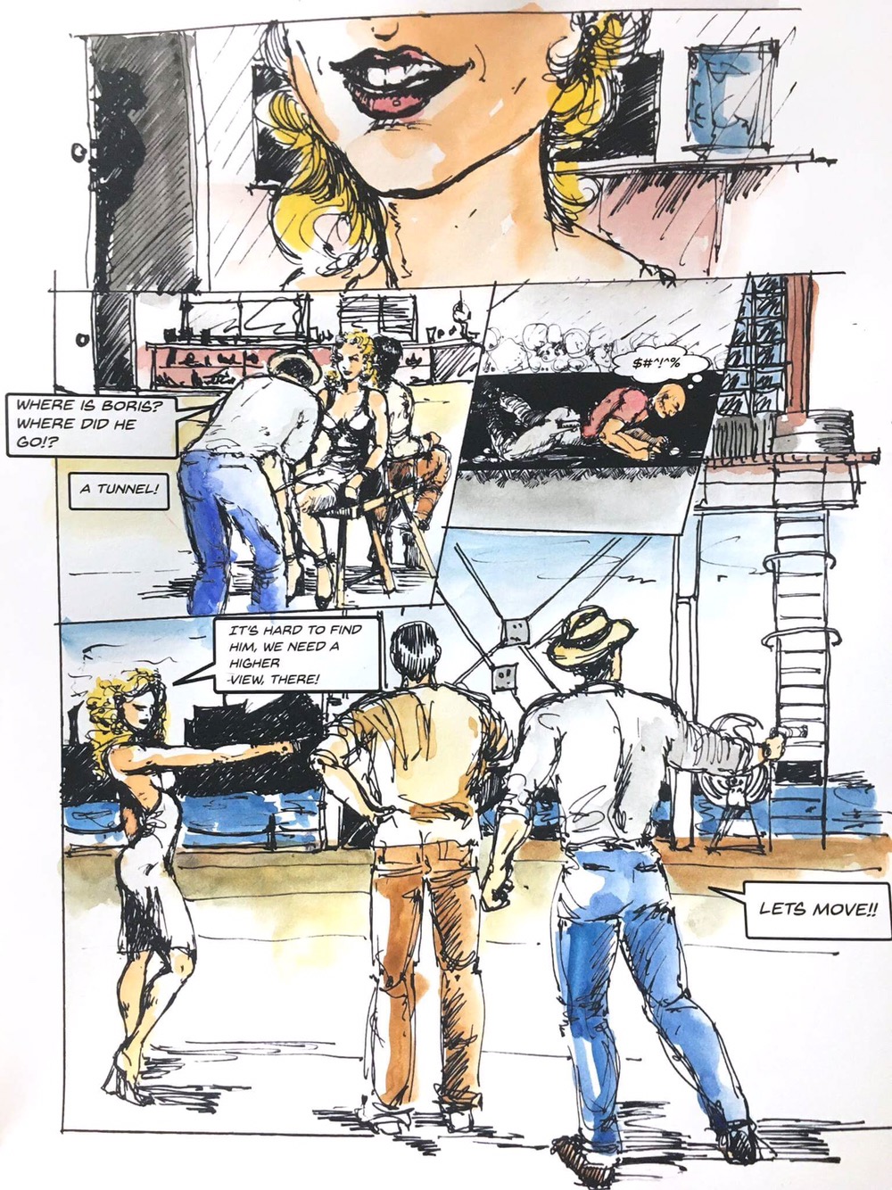
I want to share this time a process from concept to execution for drafting inking and coloring a full comic page. It was really exciting to me ! First, this below is the background story pf how this comic came to be:
Background————
We are a group of friends from different countries in the FB group SW Comics, (Wes, Palma, Marion, Nicholas, Mark, Jutta, Jorge (+), Beliza, Cat, Jim, Holger, Sofiya, Marco, Paula, Carlos, Jane, Amy, Juliet, Jansi, Mia.. *see full list in the link** https://issuu.com/norightturn/docs/no_right_turn_20170425) led by Rene Fijten and we make stories!
Do you know or have heard about “Exquisite Corpse”? (Cadaver Exquisito) It is a method of creation in which people take turns developing a story or a project, it is passed on from person to person to keep developing and extend the story. This is how our “No Right Turn” has been done so far.
——————you can follow us in instagram @sketchingcomics————-
So, Rene gave me this

From here I drafted a storyboard

Then I fleshed out all the characters one by one


At this point I thought I needed another detail for the narrative, one more drawing so it goes with the dialog given.

All the drawings were brought into photoshop for resizing and do a composite, with the layout in the draft I made or close enough
Then I printed it and added the background manually to the hard copy

The next thing was to incorporate thedialog bubbles for which I used Backissues font, a free font that it’s awesome for comics! For this I used InDesign

After that I colored the hard copy

And here is the final page all completed! 🙂
Some final thoughts:
Before starting it took me a few days to think about how to bring this concept to visual. Once I had the draft the whole proces was about 8 hrs 3 hrs one day and 6hrs today.
I think I’m comfortable with this process now!
I hope you liked it 😉
Continuing with the Vikings portraits series..
These are done with pen and ink on watercolor paper
Floki, Princess Gisla, and Helga
For more about this series see my previous 2 posts on Vikings tag


I decided to start a series of portraits of the chatacters in the Vikings TV show. The outfits and hairdos are stunning!
Ragnar had to be the first!
After a trial that left me with the itch of wanting to do something better I was finally happy with the likeness. My first try was in regular paper here:

It was too “accidental”, the new ink I am using: Deleter dries very fast and it’s very opaque and permanent, which is great! But for the final I had to use better quality paper that doesnt warp and wrinkle as much.
Before doing a final, I tried Lagertha, to refresh my eyes from Ragnar and go back to try again.

And here is Ragnar again, this time in Stillman and Birn Zeta Series paper that I cut from my large 9×12 sketchbook

I was really happy with this, ink flows nicely and smooth and wrinkle free! I specially enjoyed working the pattern in the clothing, and the beard. Scribbling is fun.
Very happy with the ink as well. I used nibs and holders for this drawing, the “blue pumpkin” and other Brause nibs. The ink dries to a rubber-like texture so it is very important to clean up the nibs very thoroughly!!
Portraits it’s my favourite subject. I have found a lot of inspiration in images from the SKCHY app community.
These portraits take from 20 to 40 min and are all done with a Lamy Pen, a pen and nib holder for the heavier lines, and the Pentel Brush on Stillman and Birn paper, Beta series.
I’m trying to be more defined by investing more time in detail. From the begining I set my mind in how much time I want to spend on the sketch. Then I draw my lines accordingly slowing down or taking time with the strokes. There is a significant difference between short or longer sketches. I always aim for the sketch to “feel” complete so when i work I work all over, like i don’t start with an eye making it all detailed, I start with an oval shape, placing marks and looking for distinct features that makes that particular face unique, I then exaggerate a little those features and find a touch of beauty that comes naturally. There is a difference in how I see and feel a face from what I try to translate it to lines. Like having an insight on what the face expresses to me. I try to reveal those thoughts visually.


